
Embracing a minimalist sci-fi aesthetic
Since this is a game aimed at the Beyblade Metal Fight audience, I want to stick as closely to the UI aesthetic that the anime shows, and therefore will try and recreate aspects of it to use in the game.
The anime uses a very futuristic style on its computers and screens, mostly just for eye candy, although some things do seem have a use, as well as the layout seeming quite intuitive. Because of this, I've designed the UI for this game with that as a base.

Old UI Flowgraph

New UI Flowgraph
From looking at flowgraphs from games like Trials Rising, a new game in the Trials franchise from Ubisoft, I was able to create charts and designs with that in mind. I saw how the designer envisioned the plan and followed how he created and designed it.

Game Modes
Tournaments
Tournaments are a way for players to show how good they are by winning matches and fighting against the best of the best in one, concentrated place. There will be a tournament every week (or month) for each range of ranks, so everyone can play against similarly skilled players.
Entry Requirements
To enter tournaments, players need:
-
At least two weeks played on their account;
-
Have won at least 10 games.
This will severely decrease the chance of griefers* and smurfs* from being in tournaments where they shouldn't be.
*By "griefers" I mean someone who intentionally makes the game worse for other players.
*By "smurfs" I mean players who play at a lower rank than they actually are, thus making it easier for them to win.
Main Menu Layout Concept

By keeping with a similar layout that the anime uses, I was able to come up with this. The main tabs are on the right, being quite large for easy access, and being on the right so they come last after reading the contents of the selected tab, and to not get in the way when reading the contents of a tab.
The minor tabs are at the top in circles, similar to the anime. These being at the top reminds people that these are indeed tabs, similar to a web browser, and the fact they're small and circular shows that they're less important than the four on the right. They are also placed in roughly the order a player would want to use them in, although "Settings" and "Mods" may switch, but "Quit" is last, as that's the last thing a player will want to do. The player's stats and information is also at the top, but in a rounded rectangle, so not only does it keep the theme of circular design at the top, but it also differentiates itself enough for the player to know that it isn't a button. However it may be the case that clicking on it shows an expanded information section in the main contents box.
The top left shows the selected tab's name, keeping with the theme of languages, the top left is the first point someone looks when reading something, so it's a good place to put important information.
The main part of the screen is taken up by the contents of the selected tab, being in a box. This is off to one side so that the tabs can fit, and so less space is wasted on the left and the bottom so the player has an easier time finding the next line they may be reading.
Attempts At Different Styles

My first attempt was this. I tried using the same colours as were used in the anime, however it didn't turn out as well as I expected. This is because the anime UI has nuances and subtleties to it, like highlights and shadows, which although small, really add to the final result. Flat colours like this look boring and plain, which was not what I was going for.
I then decided to draw inspiration from a game with a UI that I like a lot: Jurassic World: Evolution.

The colour palette used here works great with the flat style, and the outlines spice it up by adding brightness in an otherwise dark UI, accentuating the boxes they're outlining. After asking the community of whom I am making game primarily for, they liked this UI more than my first one, and I agreed with them greatly. However I didn't want to completely rip-off Jurassic World's UI like this, so I took some more inspiration but from another, somewhat unlikely, game.

I made this after realising that Plague Inc.'s UI style would actually work quite well, as it has those nuances and subtleties that the anime UI has, but this time I could get pixel perfect screenshots of it, as images of the anime are blurry and unclear. I presented this to the community again and they liked it even more than the previous one. I do agree with them on this also, however this UI was a lot harder to make because of the nuances and subtleties. Each button is made up of at least 5 different objects layered on top of each other. Yes, I can group them in Illustrator to lay them out easily, but using these buttons in a game engine will be difficult, as not only will this be my first time using proper images to create a UI in UE4, but I'll also need to create then in such a way that makes them reusable and resizable without distorting or stretching the gradients of the highlights and shadows. And once again, the thought of not wanting to directly copy another game's UI came back with this, as although it's cool-looking, it is an almost direct rip-off of Plague Inc.'s UI, and with Valve being my chosen studio, I need to innovate in the UI department otherwise I've failed trying to follow what Valve does.
The Jurassic World Button Style
Idle

Hover
Pressed
The idea here is that the button would fade between the images when it changes states (e.g. Hover, Unhover, Pressed, etc.).
When it's hovered over, the outline will appear, the dark fill image will fade away and the text will change colour. This is reversed when unhovered.
When pressed, the bright fill image will appear and the text will change colour. This reverses when released. There isn't any fading when being pressed as to give the immediate satisfaction of filling the previously outlined button will the bright colour.
Styling Mood board and References

The entire styling Illustrator document
Replay Screen Board

There's not much to put on this board apart from the video players that I know of, so there's YouTube, Vimeo, and Assetto Corsa. I didn't put in CS:GO's demo viewer and it's not very good, not only in the visual sense, but also in the layout, usability and functionality.
It's not exactly a mood board, but it's as many things as I could find.
Vimeo has a lot less features compared to YouTube, with only the settings, fullscreen and volume on the right, and play/pause on the left. The settings button does open other options up, but they're all tucked away, making it feel simple, exactly the kind of feel Vimeo are going for, easy to use. YouTube however is very crowded, with loads of buttons to press, and for some reason the autoplay toggle being one of them. However these are for videos on websites, not in games like mine is, so I won't be looking at these too much.
Assetto Corsa's replay feature lists everything along the bottom in a plain WYSIWYG manner, not trying to be clever or smart about it. This straight up approach makes everything extremely easy to find, as there's also labels under the buttons to tell you what they do if you couldn't tell from the icons. It certainly doesn't look amazing in a stylistic sense, but Assetto Corsa's UI doesn't look amazing anyway. There is a sense of developer-y style here, as if a developer has only put these buttons here to stop the hassle of typing commands in, and so it has that developer-y look to it like it's half-finished.
The layout of the buttons isn't super intuitive, but some positions I make note of and use in my own replay screen, specifically the Exit button, as that's on the left. In order to find a button, I find myself scanning along the bottom reading the labels to find it instead of instinctively going to it. This is because of the layout but also because of the opacity and the entire bar blending in with the game itself too much.
In my design, I will make sure to have it be readable, laid out efficiently, and have stark contrast to the game itself to prevent confusion. And to have tooltips or labels for the buttons just in-case.
Replay Screen Concept

I was mainly inspired by YouTube's video player here, and also slightly inspired by Assetto Corsa's replay viewer, and that inspiration does shine through here, especially with YouTube.
However it doesn't share that many similarities to YouTube as one may first expect. For example, the buttons you would want to use are in the middle, all next to each other, not in the corners like with YouTube's player. This makes each button easy to reach, as the game is fullscreen, so more time is needed to get to the corners compared to the unfullscreened YouTube player.
The buttons are also scaled differently depending on their importance. They are also laid out in order of importance, with the most important being in the middle, etc. This also serves as a visually pleasing layout.
The exit button is far on the left, distancing itself from the rest of the buttons so that the player doesn't accidentally press it. It's on the left so that it's counter-intuitive to use. To exit you must move to the left, not the right like with the natural progression of most languages, so to exit the player, you must really be wanting to exit instead of mis-clicking.
The icons used are just quick mock-ups I made, but the final results won't be too dissimilar from these. The icons should be clear, understandable, and look natural (i.e. not look out-of-place, not too large, the right corner curve, etc.).
Casting Set-backs
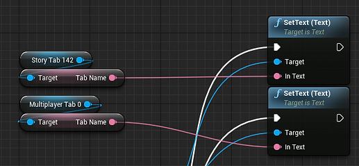
Whilst making the Multiplayer tab screen in my menu, I ran into an unexpected problem:
To be able to make the title text in the top left change to fit whatever is being done in the Multiplayer Tab's buttons (like Online, Local, etc.), I would need to access the main menu's variable for this. However I couldn't do that straight from the Blueprints because the Multiplayer Tab widget doesn't have access to it, and I can't cast because I don't have the reference to the menu to link to the cast. So instead I created another variable in the Multiplayer Tab, and set whatever that was to the Main Menu's variable (I can access the tabs' variables because they're part of the Main Menu widget), which then goes through a Switch and sets the tab title text to what I need it to. It's a bit of a long way to do it, but it's the solution I found that works.
Widget-ception
In order to set the tab title's text correctly on each widget, I got references for each button that should change screen (and therefore the text too), and binded their OnClicked events to Custom Events that changed the Main Menu's Selected Tab variables.
This isn't the best solution as it's slow and tedious to make, and only serves to confuse people if something goes wrong (which gets more and more likely the more I add to the UI). Another solution would be to have one global variable which controls the title text that can be accessed from anywhere in the entire project. However I don't know how to do this (unless I make an empty widget with nothing but that variable in, and add it to every tab and widget screen so I can access it), and so won't do it. Another solution is to see if UE4 has tag-like support for widgets, which would help greatly as that would be like assigning variables to each screen depending on the type of screen.
An Obvious Answer
After thinking about this dilemma for a bit longer, I suddenly realised that I could make a "TabName" variable in the tab contents widgets, and since I can access their variables from the main menu widget, I can set the tab title to be those variables, so then I can simply change those variables inside of the contents widgets when you click a button in those tabs (e.g. on the Multiplayer Tab, when you click "Online", the TabName variable inside the Multiplayer widget will change to "Online", which then changes the title in the main menu widget to "Online" (because I've set it changing to be in the Tick event, it checks every frame for a change).

Animating Widgets with Repeaters
A big problem I faced when trying to make easily customisable buttons and other widgets is with the animations. Sure I can change the colour in the animation and it's cool, but I can't then make a public variable which changes that colour, so I'm stuck with the same colour unless I change it in the animation itself, which doesn't work for easy customisability and won't change with each instance of it. I then discovered Triggers and Repeaters in the Timeline. These act like Timelines in other Blueprints, and allow me lerp values (which then let me make those values public to edit in another widget). It's a bit of a pain to get running and since I'm brand new to this, there's bugs like "what happens if I unhover while pressing down", etc. But for the most part it's wonderful.

I need to make new variables for each thing (like "Current Time", because if I used the same one (e.g. the hover variable on the pressed event), then it will take the current time from the hover animation instead, which will break everything. I also still need to make new animations for each state because of this also. How does the engine know that the animation event is being executed when the mouse is hovering over the button, or clicking on it? This is why I need individual variables for each state.
All Videos
All Videos


Some bugs

Example
Experimenting with Styles
After making the animation system, I started experimenting with different styles for the game. The main one was the Jurassic World style, which I made a simple example for (using three components for the animation, an "IdleFill", a "Border", and a "ClickFill") just to show how it might work.

Hover animation

Pressed animation
There are some bugs still, like constantly clicking won't play the "Released" animation like it should, but releasing the mouse click when not hovering over it works in this style I feel, so it's a feature now instead of a bug.
Implementing The Style In UE4
I exported the images from Illustrator as PNGs so that they had transparent backgrounds, and exported them to be the minimum size that they would every be used as (50x50px). Only two images were needed to be exported, because they were both white. I made them both white to keep with my ideas of modularity, and having them white means I can change their tint colour whenever I want (and so can the user). So once they were in UE4, I just changed the tint to the needed colour from my colour palette, and voila!


The two button images

The colour palette used
I then created the animations the same way as I did previously, and also added a checkbox to determine if the button will include a description or not.

The two kinds of button
Fixing The Bugs!
As shown previously, there were a few bugs to do with the unhovering when the mouse is pressed. By using Branches and a Switch, I fixed the bugs and now it feels a lot better to use the buttons.

Fixing the text changing when unhovering with the mouse pressed
I used a Switch instead of a Branch this time to make sure I know which Play Mode the nodes are happening in exactly, as going through the False exec in the Branch before could mean it's going through Ping Pong instead (which I wouldn't realise). Using a Switch completely takes out this possibility AND lets me use Ping Pong separately if I wanted to.
I also used Branches for checking if the button is pressed for the event where the player unhovers from the button and the mouse is still pressed. When this happens, it doesn't lerp the values, it sets them, as lerping them will do a fade and will look odd (which isn't clean).

Fixing the rehover over the button when unhovered previously with the mouse pressed
There is no need to use a Switch here as I'm not using the False exec of the Branch. I do use a Branch for checking if the mouse is hovering over the button, and lerp the values for True and False. I do lerp these because this is checking when the mouse is released, so it transitions between either not hovering and not pressing, or hovering and not pressing, both of which need to animate to.
After asking various people what they thought of the colours, they said it's more purple than blue. However when looking at it on my laptop, it looks completely blue. This was quite confusing, so I decided to keep most of the colours the same, but change the background to be more of a middle-ground.
This is the colour I decided on after being recommended it by someone from the audience this game is designed for.
After viewing the previous palette on different screens and experimenting with it, I've decided to make a new palette focused on more of the blue colour to make it less jarring to look at, as it was brighter before, and the more purpley background clashed with the brighter blue, giving too much contrast, and not doing very well on the eyes. This new palette is darker and the colours compliment each other a lot more, making it easier on the eyes.

This palette also gives more of the Jurassic World: Evolution style, which I like, whilst not ripping it off. This is almost certainly the best I've done yet, and is most likely going to be the one I use in my final UI.
Problems within UMG
After swapping out the default UE4 buttons that I was using previously with my own button widget that I made previously, I encountered a problem. There seems to be a random, invisible square just to the left of the screen, but only on one screen (the online section of the multiplayer tab). This could be to do with the amount of nested widgets that I have, potentially going too far into widget-ception, which could be confusing the engine somewhat and creating these bugs. No errors are being found however, so it also could just be a wrong calculation on my part.
I got to this point by asking tutors for help, and messed around with the Z Ordering of each part, and started to organise the sections into Canvas Panels instead of having them on their own. To fully fix this, I think I would need to remake this screen with a more knowledgeable approach to how to structure it, and also potentially find out the problem itself with other tests. This is also something that asking on the UE4 Forum may help with, so I will also do that.
After thinking about this for a while longer, I wondered if it was because something from the Multiplayer screen before it was messing it up, as the Online screen is inside the Multiplayer widget. So I redid the logic for the Multiplayer screen but did it in the Main Menu screen instead, so the Online screen acted as one of the tabs. This did not work. I am completely dumbfounded by this, and have absolutely no idea why it's happening. I even re-made the entire screen from scratch and it still happened.

The remade logic in the Main Menu widget which didn't fix anything.
Finding The Cause
After asking about this problem on the UE4 forums, I was suggested to use the Widget Reflector (which is extremely useful) to find what the actual problem is, and after enabling "Pick Hit-Testable Widgets", I could mouse over individual widgets and they'd come up in a hierarchy list view with their widget names. I then found the problem.

The hierarchy view of the Widget Reflector

The description box collider
By using the Widget Reflector, I could see that the thing causing the issue was the description text of a button within the Online screen itself. I don't know which button though, but I at least know that the description text is hit-testable even when it's not showing, so a simple solution would just be to make its visibility collapsed instead of setting its render opacity to 0. Setting it to collapsed instead of hidden means the engine doesn't draw the object's placement within its container, making it a lot more efficient.
So that's what I did.

Before

After
I will certainly be using the Widget Reflector a LOT more from now on.
Streamlining The Tabs
Previously, I was updating the title in the top left and the Widget Switcher every frame using Event Tick, which isn't good for performance, as I don't need to update these every frame. After doing a course in UE4's Learner Portal on introduction to UMG, I picked up a few things on how I should be doing these kinds of things, as I've always done them in the Tick event before as I didn't know better. Now however, I do, and so on Event Construct, I set an array called "TabList" to have all the tabs I use as part of it. Then when any of the widgets (the tabs) in the array are clicked, I then execute a function which contains the switching of the Widget Switcher and the tab title text.

Event Construct execution nodes
I have a variable which I'm setting to Story Button there because I plan to use that to uncheck the currently selected tab when another tab is clicked, however as of now I have not been able to pull this off.
My pseudocode for this:
Any tab is clicked apart from currently selected tab:
Deselect the selected tab
I currently have tried to remove the widget that is selected (the Selected Tab widget in Event Construct) from the Tab List array, then Bind Event to Clicked of that array without the tab widget in, then in the custom event linking to that clicked event, I would unchecked the tab and add the widget back to the array. However after removing the widget from the array before that, it then doesn't count as a clicked tab, so doesn't uncheck the previous tab, nor itself.
Making Video Options
After watching a tutorial on YouTube from It's Me Bro (https://www.youtube.com/watch?v=eNkmF7u9V8g), I created a video settings menu using my own styling. It worked well and I added other options that weren't in the video. I haven't figured out how to change the motion blur, but apart from that all the options work.

Video settings screen in the UMG editor

Hierarchy

Video settings blueprints
The blueprints can certainly be cleaned up and made a bit more efficient, but for now this will do just fine.
I have the "Apply" button on the main settings contents screen, in which the four sub categories (video, audio, game, online) are within. To make this Apply button work, I made the nodes where I set the settings into a custom event, and called it in the main settings screen as I have the Video screen accessible there, and just applied the settings using the Apply Settings node there instead.
Continuing the Tab Struggle
Using what I made in this Diary "devlog", I created a complete tab system for this project, which is shown in the video below:

I'm using the tab references inside the function instead of outside because it's cleaner in the main Event Graph

The main Event Graph showing how much cleaner the function is
Setting A Style In Stone
So far, I have made custom buttons and tabs, but nothing else, so I decided to make everything I have made look better by using the things I have made to add borders and vibrance. Examples of this is in the Settings and Mods screens, where I have lines to separate each section. These originally had borders over each thing, but they were claustrophobic and detracted from the buttons themselves, so I settled with the simpler lines instead.

The Settings screen

The Mods screen
Using Macros To Reuse Code
After thinking about how I could improve my Blueprint animation system, I came up with the idea to put it in a macro so I can access it as one node instead of copy/pasting lots of nodes and have it be really messy. This macro approach is also a lot simpler and I think more efficient, though I don't know for sure.

The Macro

The Macro in use, a lot easier than before
I decided to swap the normal Play Animation node with Forward and Reverse because:
-
I couldn't get the Play Mode variable to change direction
-
Since it's in a macro, it doesn't matter how many there are as long as it doesn't impact performance and it's easy to debug, which this is both.
Download And Play It!
I packaged the project and put it on OneDrive so you can try out the result. It's not complete, but it shows everything I've learnt so far in UMG and Blueprints, and therefore should be a good benchmark to evaluate my progress later in the year.