Task 2
Tabs VS Grids VS Lists
Modern games tend to use two approaches when making a game's UI:
-
Grid Layout
-
Tab System
Simpler games more often than not use lists instead of grids or tabs as they're easier to make and fit the simple style, as there's less information needed to display. CZ:DS originally used an amalgamation of lists and tabs, with a list for the main buttons, and tabs in the windows that popped up into sub-menus. My aim for this remake however is to make it meet modern standards, and as such, will be aiming for both tabs and grids, and trying to stay away from lists.
Risk Assessment
This risk assessment is for the project and many other aspects about what makes it work that you may not have thought of (for example, taking the train to college). It is so that I have a point of reference when performing a task to then make sure I take the correct precautions to prevent the hazard as much as possible. If the hazard occurs still, then that would just be down to bad luck (if I took the precautions that is), and would therefore be a detriment to my project.
Something I can't really put on the table is how audiences respond to my ideas. They could not like them, which would make me rethink my whole concept, and they could also just ignore my requests for feedback, which wouldn't be useful at all. Maybe the worst of all of these is the audience providing feedback for a non-issue, or not understanding the vision. This would be a mistake on my part, and a failure to explain what the project is exactly, and would be frustrating because of the work I'd be putting in to then not be understood.
The prevention to this would simply be to follow a design plan. A consistent theme that carries on throughout the UI so there aren't design clashes, which could break the whole project.
CS:GO VS Valorant in UI Styling
Valorant and CS:GO take two different approaches to UI design, with the former being detailed and specific, and the latter being minimal and greyscale. In recent months, additions to CS:GO's menus have made them less consistent, with some drop downs having their options have animations, and other not, as well as the sizes of the boxes that appear when hovering over certain elements, most noticeably the new-ish radio buttons for the length of a competitive match, showing that they have no padding for the text.
Valorant does try hard to make its UI elements feel individual to the game, with generic buttons sporting borders and dots in the four corners that move inwards when hovered over. This design style works, but similarly to CS:GO, is not fully consistent throughout the game. The most notable example of this is when the player goes to buy Radianite, where the buttons used there are clearly made in a different way to Valorant's normal buttons, as they don't snap back to the start of the animation for certain states.
The default Valorant button. Hovering over it before the unhover animation finishes makes it start the hover animation from the start, making that "snap" effect happen.
These buttons look similar to the default ones, but don't snap as much, they do wait for the animation to finish, they're just impatient (to put it in a weird way)
These buttons don't even have animations. This is to be expected as they're most likely using a third party plugin to make them which doesn't allow for animations, so they tried their hardest to mimic the normal style.
Valorant does do a good job at being mostly consistent with these buttons though. However, although consistent, they haven't tried much in the vain of the drop down (not a combo box). These are default UE4 Combo Box elements with colour changes, and thus look very odd with the rest of the elements.

The game mode drop down in the Career tab.

The drop down boxes in the settings. It looks very out-of-place.
So, Valorant is quite good with consistency, with its tabs and sub tabs all being almost exactly the same (with some minor padding discrepancies), but how does CS:GO fare?
CS:GO's normal drop down, used in the settings, inventory, and wherever else a drop down may need to be used. These all act the same way, not having an animation when hovering over the items in it.
They also all fit with CS:GO's overall style.
These drop downs are used in newer screens, like the CS:GO 360 Stats screen introduced in Operation Broken Fang, and have animations for the hovering over items, which in my opinion, makes them feel slower and provides less feedback, not to mention the fact they're not consistent with previous drop down menus.
Deciding on the Styling
Both CS:GO and Valorant's UIs don't really relate to the style of the game itself, they're more so like non-diegetic interfacing screens which don't exist in the game world. Valorant's is more stylistic than CS:GO's, with those dots and borders to emphasize the cartoonish style, but still isn't as diegetic as it could be. Because of this, and because I'm not great at detailed designs, I will lean more towards the minimal style of CS:GO, as it brings a touch of the familiar from what Counter-Strike players are used to, and because older CS games don't have a specific UI style.
Asset List
I created an Excel spreadsheet to keep track of which elements and screens I've done, and which still need to be done. After finishing each element, I mark them off by colouring their text red.


Keeping plans up-to-date
When working in a team, it's important to keep plans and things like asset lists up to date, or else people working on the project might do something that is completely unnecessary and a waste of time. In order to make my plans as easy to get to and read as possible, I'm utilising the following Kanban board on Jamboard to keep track of the work I need to do, the work I'm doing, and the work I've done. This also lets anyone else with access to it see those sections too. Another Kanban-type site I could use is Trello, which is a lot more specifically designed for this kind of workflow. Google Jamboard is more of a general collaboration tool than a specifically Kanban tool. Other sites include Monday.com, GitHub, or even Discord with channels designated for certain documents and design aspects. Using these sites lets you choose colours and even roles for different members, which really helps with organising which tasks are being done by which person and when, allowing for a dynamic and easy view of the project's development.
In order to let team members get updates in real-time on the project itself, a source control client must be used. These include GitHub and Perforce, with Perforce being the most popular. Using software like this mitigates the troubles of sending files to each other constantly and syncing errors, and instead keeps everything in one place that members can access, edit, and push requests to merge to. It speeds up the development process a lot in teams, and is a must for any team working together on anything.
As I am working by myself in this project, I am only using the Google Jamboard Kanban board, however I am keeping in mind the workflow and process of using it with a team of people, and so use it as if I am in a team, and the team need to know what I've done and what I'm working on for them to do work related to it.
Kanban Jamboard


UE4 Folder Structure
Unreal Engine has many similar folders structures, with many people doing slightly different things, but the main, general structure still remains:
- Root
- Blueprints
- Weapons
- Items
- Materials
- Textures
- Levels
- Campaign
- Multiplayer
- UI
- Styling
- Tab Contents
UE4 also has a few different naming conventions, each with subtle differences. I will be using Allar's UE5 Style Guide. Since I will work mostly with UMG's widgets, most of the files I create and use will have the "WBP_" (Widget BluePrint) prefix, with the exceptions of my custom elements for styling, which will have the "CZUI_" prefix (Condition Zero User Interface).
Initial Menu Plans
My first thoughts for the main menu was to use tabs at the top of the screen to navigate between four main pages:
-
Campaign
-
Multiplayer
-
Inventory
-
Settings
This first idea followed a similar setup to Riot's Valorant, a competitor to Counter-Strike, where all the main tabs are at the top in order of importance from the middle outwards.

I created a simple UI flowchart for this idea, which outlined simple functionality ideas for each screen through coloured nodes with a key.


One problem with this idea however, is all the tabs are connected to each other on the main screen. To elaborate on this, the inventory and campaign tabs shouldn't really be shown on the same screen because they have no relation to each other. So instead, I started brainstorming how to create a system like Call of Duty 4: Modern Warfare, where the singleplayer and multiplayer parts of the game are like two separate programs. Players choose which they want to play before the game is loaded, and it loads a different layout depending on which is picked. I could certainly do something similar to this, however having a menu that just asks "Singleplayer or Multiplayer?" isn't too fun. I could instead just move the Inventory tab as a sub tab of the Multiplayer tab, but that would then use up valuable screen space.
My answer to this isn't actually UI related, it's just to have the singleplayer use the skins and items in the inventory the same way the multiplayer does.
Multiplayer Screen
Both CS:GO and Valorant have their game modes at the top of the screen as tabs. There isn't much difference in the ordering of the tabs, as both are laid out in order of what they deem most used or important (e.g., CS:GO's is Competitive and Wingman first (the two ranked game modes), and Valorant's is Unrated and Competitive first (ranked and unranked versions of the same mode)).

CS:GO has more game modes however, and each tab has multiple different options within it. For example, Competitive has options for a short (9 rounds) or long (16 rounds) match, as well as if it's ranked (affects matchmaking rank) or unranked (doesn't affect matchmaking rank). These sub options will be replicated in my Condition Zero remake because they work within the tabs they're in, so each tab is like an enclosed game mode in itself, similarly to an options menu, where there might be so many options that each are put under main tabs (like Video, Audio, etc.), and in those main tabs, many sub tabs are listed (for Video for example, Graphics, Resolution, etc.), which make everything organised and easy to sort through. The options that should persist through different modes (like Ranked Matches and Open Party) do, and stay checked or unchecked throughout the different tabs, which stops the problem of having to remake them for each tab.

In CS:GO, players can select which maps they want to play on, which allows them to learn a few maps and play those until they are comfortable, and then expand out to more maps. Since there are a lot of maps, this makes sense. In comparison, Valorant doesn't let players choose which maps they want to play on, instead picking a random one for them. This is good because it forces players to learn each map in order to have a chance at winning the match. However, there are a lot more downsides than upsides, some being:
-
Players tend to "dodge" a map they don't like (not pick an agent, forcing the match to end before starting, wasting everyone's time)
-
Most maps have very biased opinions from players, with some being negative, and others being positive (e.g., Icebox has a very negative perception, causing it to get layout changes which then further add time that players need to spend learning it, making them want to not play it more)
-
New players will want to pick the map they like most and stick to it, like CS:GO players do. You cannot do this in Valorant. If a player gets a map they don't know how to play, and they don't want to dodge (it can give you a cooldown), then they will probably get shouted at by their teammates for not playing well, which then adds to the problem of toxicity
These downsides could be excused by the fact that there's short wait times for a match, or that there aren't as many maps in Valorant as there are in CS:GO, but if you queued for every map in CS:GO, the wait time would also be quite short, it's just that no one does that because no one knows how to play all the maps.
A downside to CS:GO's system though, is that trying to learn a new map is harder, because the player learning it will be against players who know the map and so won't be able to play to their full potential. This separation of players is very apparent in the hostage game mode, where most players who play the map "Office" know the map so well, even well-seasoned players will lose to them purely from their knowledge of the map from only playing that map. Not to mention the amount of cheaters that like to play it for one reason or another.
In conclusion, I will go the route of CS:GO's map selection, because it gives players the freedom of choice when playing, and no new player wants to be bombarded with multiple maps they suddenly need to learn just in case it gets chosen randomly. Having the knowledge and security of picking your favourite maps is something that should be available in any multiplayer game like Counter-Strike or Valorant, it just isn't fair on the player to expect them to learn every map the game has "just in case".
First Layout Draft
I created a simple layout draft in Unreal Engine of the Campaign tab:

The plan is to have the Load Game and New Game buttons look like the World Map button when the mouse isn't hovering over them, then have the text grow smaller and move to the top left of the button, and have the sub buttons fade in, all within ~0.3 seconds. Either that, or not have the big buttons as buttons at all, and instead just a border or background image, and not have any animation.
Applying Fitts' Law to this, showing more information on the hover is a good thing, as it means the players don't need to use more effort to click or go through more menus in order to get to the thing they want in the game. It's quite streamlined, and also quite large, which means that it's easier for players to get to buttons as there's less distance they need to cover, something specifically stated in Fitts' Law.
Taking C.R.A.P. into account, contrast doesn't matter at the moment because it's a wireframe currently, repetition is used to have the three big buttons show more underneath, and will also be used in the styling to provide consistency which allows the player to make a note that this is what this style of button does and where it might be used, alignment is used to place the Load Game section on the left and make it the largest, as players will be using that the most, and will also quick save a lot, so allowing a large vertical space for those saves is crucial, and proximity isn't used as much, but is still prevalent with the three buttons all being for the campaign tab, without including anything from other tabs that aren't related.
An idea I had with the replays system is to have that be one of the main tabs, so that players can record replays of the campaign within the game and watch them from the main menu without needing to go into the multiplayer tab to find them. This makes third-party clipping tools obsolete, as the replays will be data captured from the game instead of a screen recording, so the quality will be infinitely better, and mods can turn a seemingly normal recording into an awesome display of effects. The only problem with this approach is the tickrate of the recording, essentially the FPS at which is records the data. This can easily be a setting in the Settings tab, so the player can change that there depending on how much storage and quality they want it to be. In addition, because the game is recording the data and not a screen recording, the file sizes should be a lot smaller as they are not resolution dependent.
I decided to test if this was true so that I had evidence, and yes, a demo file is smaller than a 1080p recording of one round.


Now, a clipping program like Medal compresses the videos, which makes it ideal for sharing 30 second clips and such to friends, however they aren't great quality because of the compression. Sure they have smaller file sizes, but the cons are too large for them to be use for anything more than "look at this cool kill I got". Therefore, I believe demo files are the way to go for full game recordings and clips, as then they can be viewed however anyone wants, with different angles, resolutions, aspect ratios, skins, mods, etc.
Multiplayer Layout Initial Idea
Creating the initial layout for my planned multiplayer screen wasn't too difficult. I took CS:GO map selection screen and added a bit of Valorant to it with the lobby at the bottom, as well as added my own game mode properties, which also change which maps are displayed and which maps can be checked.


The problem with the way I've created this layout currently though, is that I've used a grid that resizes with the window, which then makes the map buttons resize, causing them to look like that on a 4:3 monitor, but then grow wider on a 16:9 monitor. This wouldn't be much of a problem if images weren't involved, but I'm going to have images of each map on the buttons to show a visual representation of them to the user instead of just the same, so stretching the images on 16:9, or vice versa would be quite jarring and annoying. So using a system that keeps their sizes as well as lets them be used in a scroll box with those predefined sizes is a must. A size box will allow me to do this, and so after a bit of tweaking, I came up with this:


I achieved this by using the aforementioned size box for each map button, but then using a wrap box to make the buttons move to the next line when they no longer fit on the screen. It's more or less the same as wrapping text in a text box. All this is in a scroll box, so if the maps wrap enough to three lines, then the user can scroll to reach them, ensuring a smooth and intuitive interface.


Hierarchy:
- Widget Switcher (Switches between maps for 2v2 and 5v5 modes)
- Scroll Box (to scroll when the Wrap Box exceeds three lines)
- Wrap Box (to wrap the buttons like a text box)
- Size Box (to set exact sizes for the buttons so they cannot stretch)
- Button (the actual button)
- Text (the name of the map, will also include image, etc.)
Replays Tab Contents
The replays tab was probably the easiest to make, as it's essentially a list of the recorded replays with buttons to let the user:
-
Watch the replay
-
Download the replay
-
Delete the replay
Replays will automatically be stored on another server until they are downloaded, and the best thing to do would be to let users watch the replays without the need to download them for the first week or so, then they would get deleted from the server, which then doesn't let the user download them anymore. The user can download them at any time in that week however, and keep them forever like a normal video file, and they will show up in that list of replays. The idea of downloading the replays is so the user has a permanent way of accessing it, and also lets them send it to friends, etc.

I made a "Replay settings" button so anyone who might be confused to where to change settings with the replays, or didn't know you could, will see it and find out what settings they can change, which eliminates the need to look it up on Google or ask a forum, something that should never be the case.
All replays will show up here with the name being the date and time they were saved (both campaign and multiplayer replays show here, campaign being clipped replays, and multiplayer replays being clipped and auto-created ones after each game, the same as what CS:GO does). This naming lets the user remember which is which. Writing about this now I should add a "Rename" button also, so they can organise them, which could also lead on to filtering options, something I never thought of until now. Once the replays are deleted from the server, they disappear from the list.

Home Screen
Something both CS:GO and Valorant have is a home screen, which I guess is also in CS:CZDS when all the windows are closed. I decided to make one because it's useful as a splash screen for when you don't want to be on any other tab, and also contains information that doesn't fits anywhere else, like the most recent news from the game.

I decided to have a "Quick Continue" section there so players can spend less time navigating to the Campaign tab to the continue area, and instead just clicking there for their most recent save.
After finalising on my theme and styling, I will create a background to go here as eye candy, but for now it's bare and blank.
Inventory Screen
I took heavy inspiration from CS:GO's inventory screen here, as Valorant doesn't have one, and there aren't many other games similar to CS:GO, so my options were limited. I decided to utilise Size Boxes and Wrap Boxes like I did on my multiplayer screen for the items. These buttons will have icons for which icon they are, as well as a colour for their quality (or rarity maybe), and so won't stay as "Item". They will also have a context menu for when you click on them, which these options:
-
Inspect
-
Equip (for CT/T)
-
Sell
-
Delete
These options are all quite self explanatory and similar to CS:GO's.

The filter settings are in the same place as the replays screen and the multiplayer screen to keep consistency and memorability for the user, which cements in their mind that the filter for things is on the left. They allow for easy and quick sorting of the items without being overwhelming with how many there are. If all else fails the user can simply search for the name of the item.
Settings Screen
The settings screen is where I paid very close attention to the original game, with the idea of simplicity is bliss carrying through it. I also stuck with the idea of trying to avoid lists, and so used Grid Panels throughout to give it a more "robust" feel.
Video:
The Video settings are the first example of this:


I took the Source Engine's settings idea (that being the most simple and used settings are presented straight away with more advanced settings hidden behind a button) and applied it here, so that players that may not know what these settings do don't need to mind about them, they can just set the "Quality Preset" to whatever their computer can handle and that's that. The tabs are in the middle still because I moved the main tabs left and now I'm not sure where to put these tabs, similar to the multiplayer screen now.
Audio:

This screen follows the same rules as the Video tab, however it does look a bit barren which is due to the use of a Grid Panel which splits the screen in two. They could do with being moved towards each other towards the centre, also to allow more breathing room at the top to add padding.

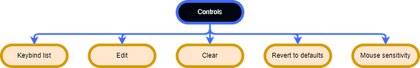
Controls:

In order to create the keybinds section of this screen, I used yet more Grid Panels, but only utilising their columns, as each Grid Panel is a different row.

I used a nifty widget called the "Input Key Selector" which lets the user click it like a button, input a key, and it saves that key to be used later, which makes it very useful for re-binding keys for actions.
The "Mouse" section is separate lower down from the Keybinds, because in CS:CZDS, it's a different tab, but here, with more screen space, I thought it made sense to put it under the Controls tab with the keyboard stuff.
Multiplayer:
This screen is not yet done. The crosshair settings alone were a bit of a hassle to make because of the amount of Grid Panels I had to use to get it right.


It's not perfect, but it will do for now as a plan. I don't have much else to say about this since it isn't finished and there isn't actually much to say about it.
Replays:

There's not many options to change here, so the layout for this screen may need to be altered a bit to fully utilise the available space, but for now it's quite alright. The "Replays settings" button from the Replays screen before goes straight here, which acts as an easy way for users to get here. It uses the same "Input Key Selector" that the keybinds do, which made wonder if the Hotkey for clipping should be there instead, but that would cause more confusion than it solves, as it makes sense to be here instead as it's more accessible.
The Multiplayer HUD
Once again, the HUD took great inspiration from CS:GO's HUD, as it's almost the perfect positioning of the HUD elements for an FPS game.

After sending this to various people for feedback, one of the most stated things to change are the health and armour bars, taking them out and instead just having the numbers like in Valorant. This will certainly improve screen space and let the numbers get bigger and clearer, so here is it without the bars:

After more feedback, I increased the size of the health, armour and ammo counters and changed the kill feed a bit. I may change the size of the radar, but for now it's good.

Feedback on Main Menu
After asking some UI and UX experts on various Discord servers, the main feedback I received was the X in the top right of the screen, that it should say "Quit" or something clearer instead, and also that the inventory sort options should be at the top and possible something to enable or disable. I tried making a checkbox for the sort combo box, but then realised that the items have to be sorted in some way anyway, so being able to disable the sort doesn't make sense, so I instead set the default selected option to "Date", which will put the most recent items at the top, which is what happens in CS:GO.

Styling Ideas
Taking heavy inspiration from Valorant's buy menu, my buy menu's styling will be similar, and the greyscale theme will also carry on throughout the UI (inspired by CS:GO). I used the same Blueprint Animation technique I made in Project 2 for this button, however instead of animation both the hover and unhover states, I only animated the unhover state, with the hover state snapping instead of fading.

This made a problem however, where after unhovering the button, if you hover over it again before the unhover animation has finished, then it doesn't execute the hover state, which keeps the button in the unhovered state whilst being hovered over, which is definitely not a good thing.
To solve this, I simply just stopped playing the animation first thing before changing the colours of the elements in the button to make sure it reset when being hovered over, thus removing and solving the problem.


This is an initial main button idea, which features a fill, text, and a border. I don't really like how it turned out, and don't think it worked with the idea I had before, so decided against it. This is mainly due to the boldness of it. It looks "thick". The border, the text and the background colour all contribute to this look, and so make up a different feeling to what I was going for. In the environment where I would have this (a glass-y styled screen), it doesn't work at all, so I scrapped it.
Main Menu Tab Styling
I decided to take heavy influence from CS:GO's menu styling for the main menu, as that's not only the target audience, but also the best looking in my opinion. After playing CS:GO and Valorant to get a feel for both of their interfaces, CS:GO's feels a lot like glass, in that it's delicate and looks like it could shatter at any moment, something that I personally really like as it's a hard feel to pull off. Valorant's however is like a lump of clay, satisfying, but ultimately not as delicate or precise as the glass, it doesn't have a "fine-tuned" feel to it.
The main thing I got from CS:GO is the lines under the tabs' text. These appear when hovering over the tab, and get bigger when they're clicked on. I decided to do something very similar to this, but also add a gradient, because I feel also CS:GO's UI is very fragile and specific, it is a bit too fragile and specific, so adding gradients will reinforce it somewhat. I do want my own UI to have a glass feel to it also though.
I made the gradients with a material, utilising a "LinearGradient" node and putting that into a Lerp node with the colours for the A and B inputs, which then goes into the final node which has the Material Domain of "User Interface" and the Blend Mode of "Additive", which makes the darker areas more transparent.

References
wyldfantasyx. (2013). Big Red Arrow royalty free vector. Available: https://www.deviantart.com/wyldfantasyx/art/Big-Red-Arrow-royalty-free-vector-352343863. Last accessed 20th April 2022.