Inventory Items
- Mar 28, 2022
- 2 min read
Skins and other items in the game need a place to be stored and viewed, so an inventory is a great way to show them. I decided to make it similar to CS:GO in colours and shape, but being able to show more items on the screen at once. From my planning, I knew I'd have settings within each item like:
Name
Quality
Rarity
Weapon
Weapon Group
StatTrack
These all need to be shown in one form or another, so I tried different layouts. This is one I quite liked in concept, as well as Harrison, but in practice it didn't work well at all:


So I went with another idea I had, which I then made in UMG:

The weapon is shown in both the image and the text under it, and the skin's name is the largest, which is what you want to see first, as well as the image showing the skin. The quality is shown as an acronym on the right, using the same terms as CS:GO (Factory New, Minimal Wear, etc.). The rarity is dictated with the colour of the item, using something similar to CS:GO, going from white, then blue, then red, then gold. Finally, the stattrack indicator is a star in the top left with "ST" in to show that it counts kills. Something my brother suggested I add is the amount of kills the stattrack skin has got in one of the corners of the item, however when I asked other people about this idea, they said it wasn't needed, as people aren't going to check their inventory just to see how many kills their skin has got. After asking Charlie Wass for feedback, he suggested making the knife rarity stand out more, as it is the rarest, and also suggested to make the text change colour with the rarity, so I changed it like so:

After doing this however, the Restricted rarity of skin (purple, the Rat Rod AK-47) made the text unreadable when hovering over it, meaning I needed to change it to a lighter colour. I didn't want to make it too light though, as then it would be too hard to tell apart from the pink, so I had to be careful with it. These are the colours I settled on:


Each item has easily accessible and changeable settings to aid in the creation and sorting of them:
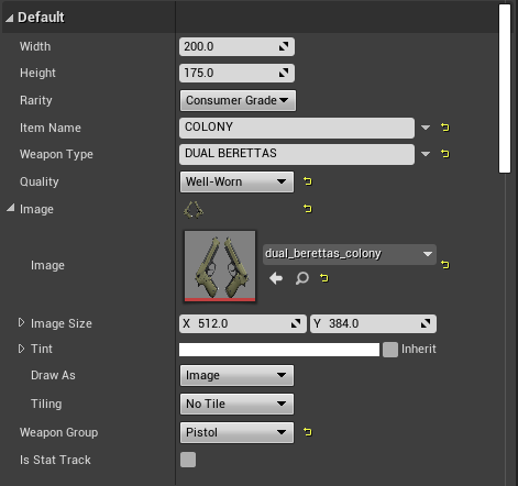
To make sure the weapon images are not distorted in any way, and to make sure they're all the same size, I used a Scale Box, something I also should have used in my map selection buttons as that would have made the images adaptable to different resolutions without stretching them. This is because a Scale Box sizes its contents to fit the width or the height, whichever is smallest.


Comments